
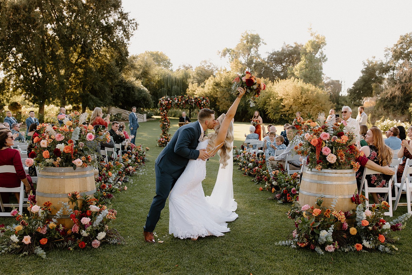
Photography by Autumn Agrella
There is a particular hour in September, somewhere after five and before the light goes, when the hills around Jamestown turn the color of old brass. The oaks hold onto their green a little longer than they should. The dry grass glows. And every deep, saturated color you brought with you, the plum in a bridesmaid's dress, the merlot at the heart of a bouquet, the bronze on the edge of a dahlia petal, stops being dark and starts being lit from inside.
That is the whole argument for a moody fall palette in Gold Country. It isn't about making your wedding somber. It's about choosing colors that this landscape, in this season, at this hour, knows exactly what to do with.
We've been designing weddings in the Sierra Foothills for a long time now, and we can tell you that the palettes that photograph best here are almost never the ones that fight the setting. Ice blue is beautiful. It is not beautiful here, in October, against granite and oak and a hillside that has been going gold since June. But plum, merlot, olive, terracotta, espresso, antique gold, those colors were pulled straight out of the ground you're standing on.
Here's how we build them, and what actually blooms in them.
First: moody is not dark
Let me clear something up, because we hear it in consultations every single fall.
A moody palette is not a dark palette. If you build an entire wedding out of colors that all sit at the same low value, everything deep, everything saturated, nothing to break it up, you don't get romance. You get a hole. The flowers disappear into the linens, the linens disappear into the shadows, and your photographer spends the reception fighting for every frame.
What makes moody work is contrast inside a warm family. You take those deep tones and you give them somewhere to breathe: a blush that's been dirtied down, a cream that's gone slightly antique, a dusty peach, a pale sage. The deep colors become anchors. The light ones become the glow between them.
The way we think about it, and this is Susan’s Ikebana training talking, which never really leaves you, is that negative space and light value are materials just as much as the flowers are. You are not filling a vessel. You are deciding where the eye rests.
The palette, color by color
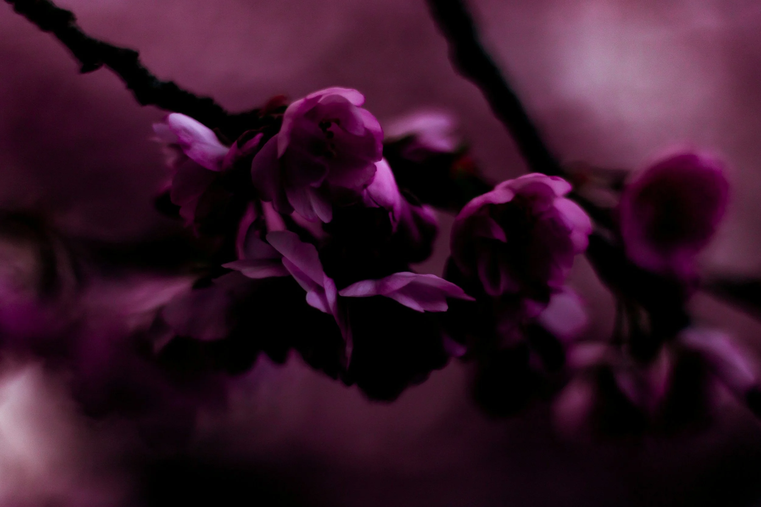
Plum
Plum is the backbone. It's the color that tells everyone this is a fall wedding before they've read the invitation.
Where it comes from: dahlias (more on those in a moment), lisianthus in its deepest varieties, scabiosa, plum-toned garden roses, and, our favorite cheat, the underside of certain foliages, which run purple when the season turns.
Plum is generous. It takes gold light beautifully, it doesn't go muddy in shade the way true purple does, and it plays well with almost every green we can forage.
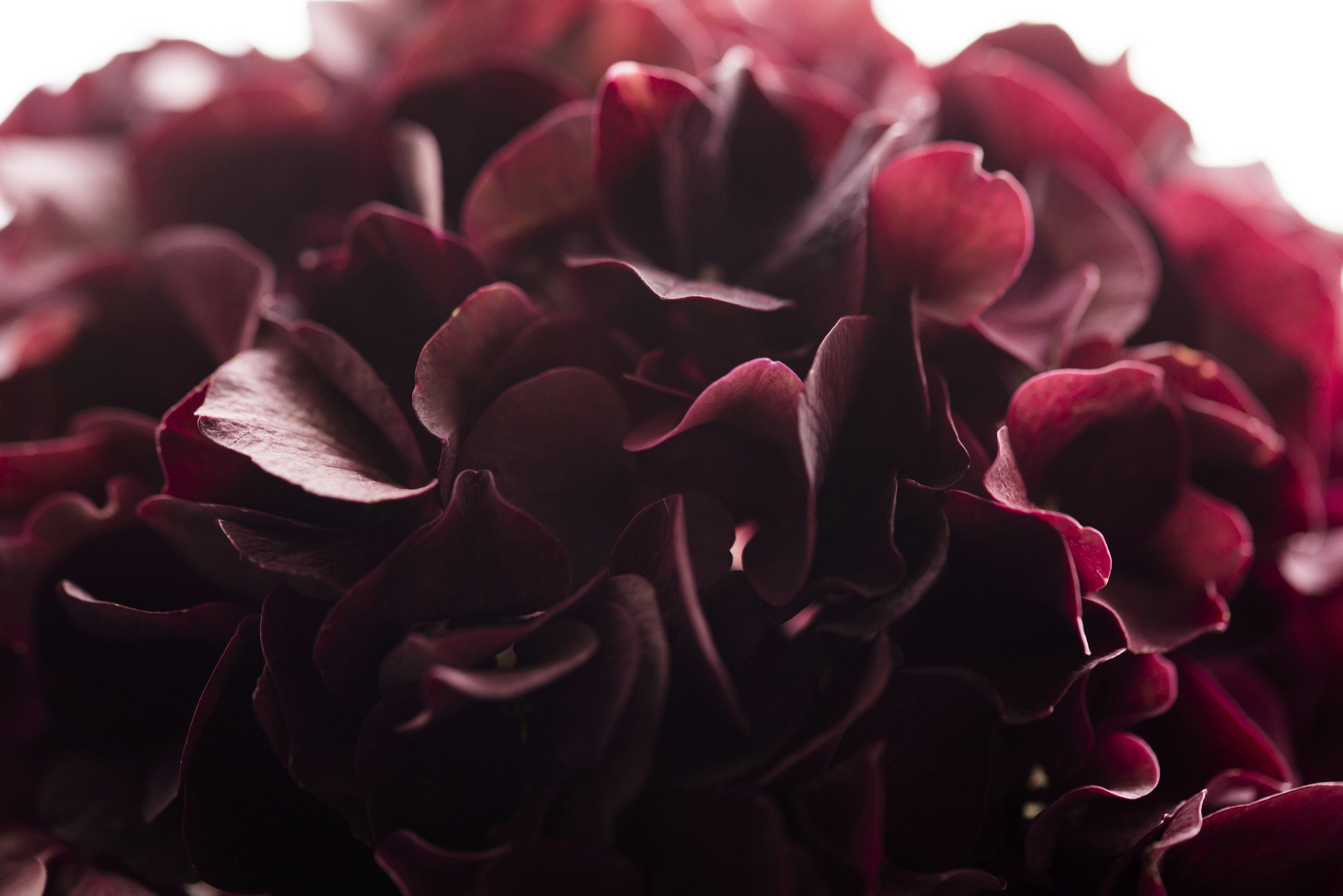
Merlot & burgundy
This is where the drama lives. Merlot is plum with the volume turned up and a little more red in it.
Where it comes from: burgundy dahlias, chocolate cosmos, deep ranunculus in the shoulder of the season, amaranthus (both the upright and the trailing kind), scabiosa pods, and burgundy ninebark foliage.
A word of caution: merlot is the color most likely to swallow itself. In direct midday sun it flattens into a dark shape with no detail. In candlelight it is unbelievable. Use it where there will be low, warm light, reception tables, an evening ceremony, an installation that will be photographed after the sun drops behind the ridge.
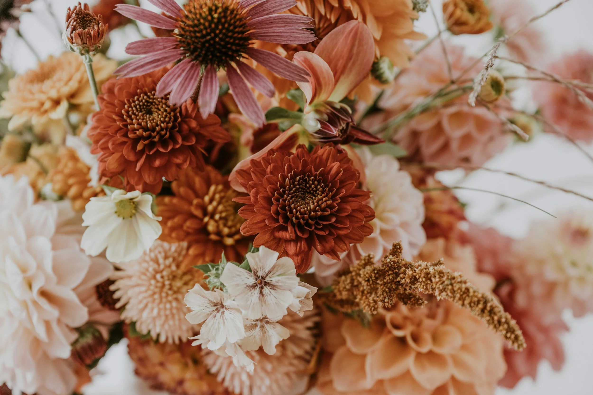
Terracotta & rust
Terracotta is the peacemaker. It's the color that lets plum and merlot exist next to something warm without the whole arrangement going purple.
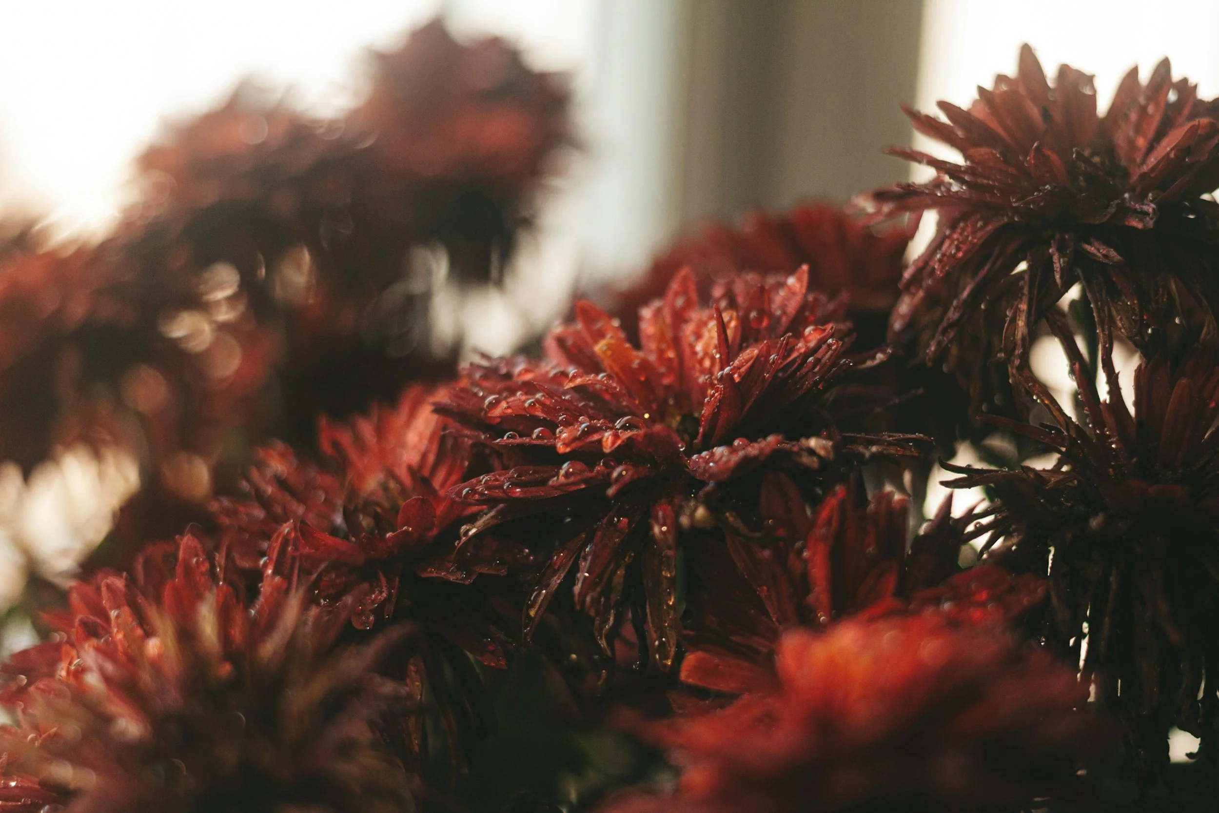
Where it comes from: rust and copper dahlias, chrysanthemums (yes, chrysanthemums, the garden varieties are extraordinary and nothing like the grocery store version), carnations in their bronze tones, dried grasses, seed pods, and the first turning leaves.
Terracotta is also the single most forgiving color in Gold Country photography. It is essentially the color of the hills. Anything terracotta will look like it grew where you're standing.
Espresso & chocolate
The newest color in this family and the one couples are most nervous about. Brown, in a wedding, still sounds like a mistake to a lot of people.
It isn't. Chocolate cosmos, which genuinely smell like cocoa, and which I'll talk more about another time, near-black dahlias, and brown-centered foliage give a palette depth the way a bass line gives a song depth. You don't notice it directly. You notice that everything else got richer.
Use it sparingly. Ten percent of an arrangement, no more, unless you really know what you're doing.
Olive, forest & foraged green
Green is not filler. I want to say that as loudly as I'm allowed to say anything.
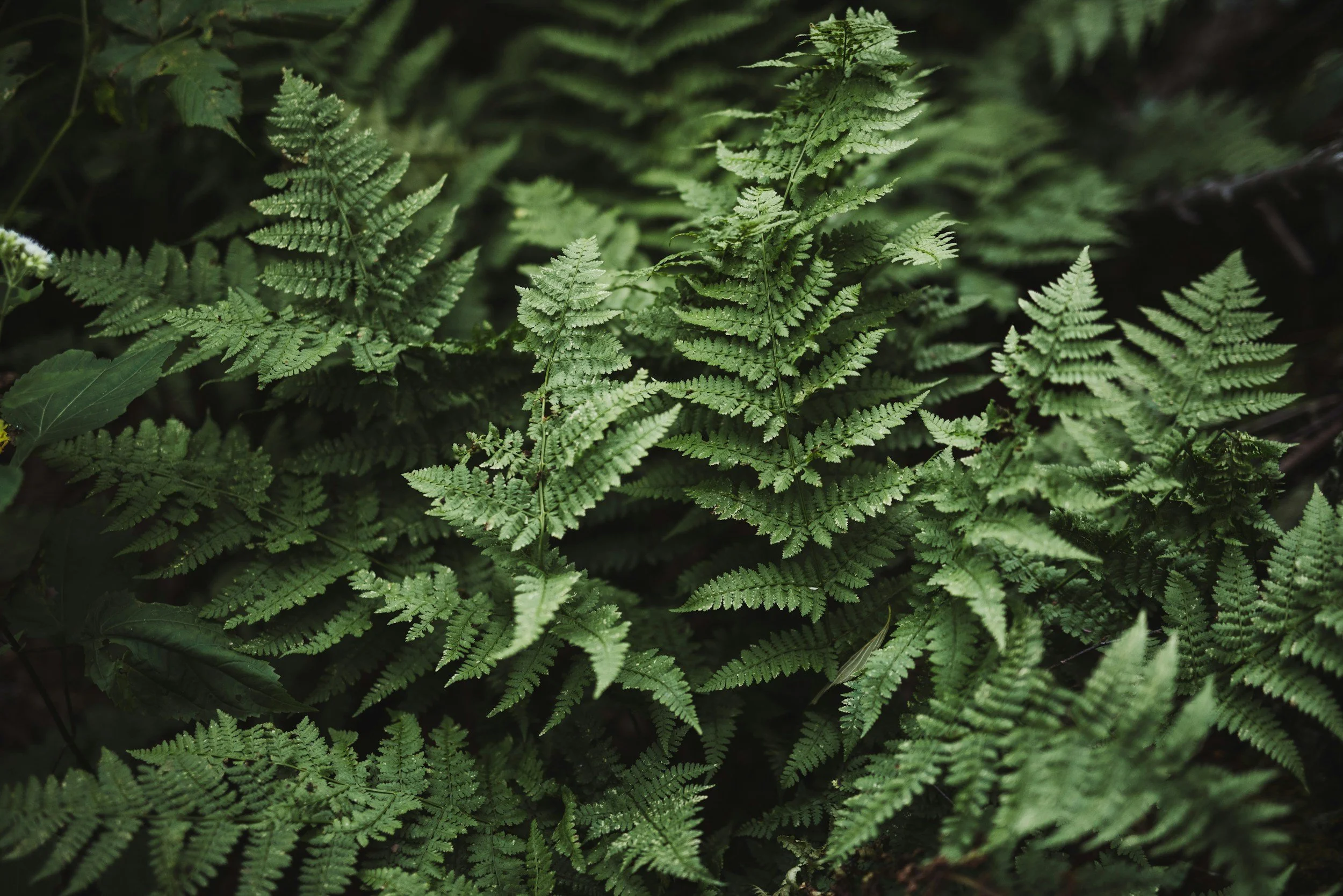
In a moody palette, green is the structure and the relief. Olive is soft and dusty and pushes the warm colors forward. Forest and deep eucalyptus give weight. And the foliage we forage locally, oak, wild grasses, seed heads, the odd branch that has started to turn, is what makes an arrangement look like it belongs to this place rather than to a wholesale order that could have landed anywhere.
If you take one thing from this post: spend your green budget on interesting green. It does more work than an extra dozen roses ever will.
Antique gold & dirty blush
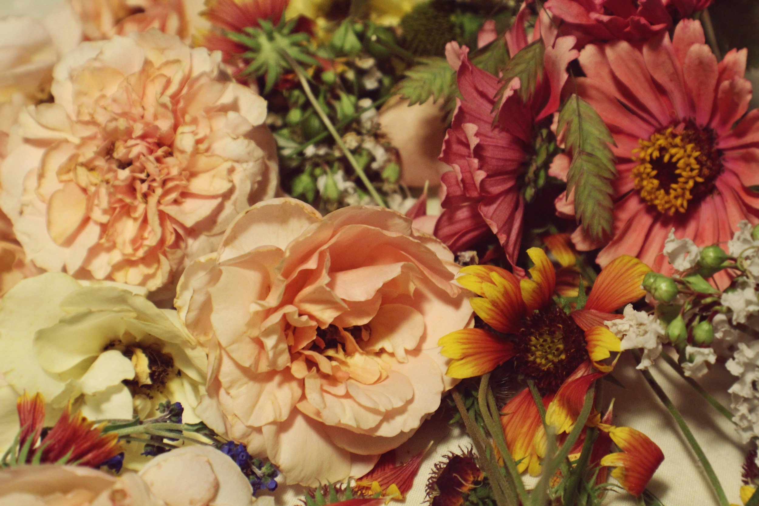
Your light values. Cream that has gone slightly ivory, blush with a bit of taupe in it, pale bronze, the parchment color of dried bunny tail and strawflower.
These are the colors that keep a moody palette from collapsing. They catch the golden hour and hold it. In photographs they read as light itself.
The dahlia: September's whole argument
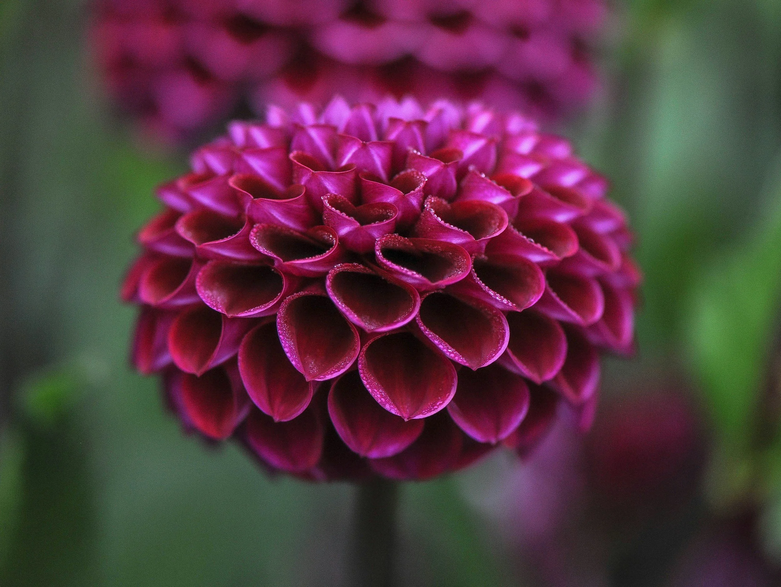
We could build every palette above out of dahlias alone, and some Septembers we nearly do.
The dahlia peaks right now. Late August through September is its absolute moment, the plants have had all summer to build up, the blooms are at their largest and most saturated, and the local growers we work with are cutting more than they know what to do with. By mid-October, depending on the year and the first cold night, it's over. That window is short and it is the best thing about a fall wedding here.
The varieties I reach for:
Café au Lait - the one everyone has seen on Pinterest, and deservedly. A dinner-plate dahlia the size of your two hands together, in a blush that shifts between cream, peach and pale coffee depending on the light and on the individual flower. No two open the same color. It is the single best "dirty blush" in existence, and it is what keeps a moody palette from going heavy.
Karma Choc - deep, velvety, near-black burgundy. This is your merlot and your espresso in one flower. Under candlelight it looks like it's absorbing the room.
Dinner-plate varieties in rust and bronze - the terracotta workhorses. Enormous, structural, and they let me build a large-scale arrangement with fewer stems, which matters more than couples expect.
Ball and pompon dahlias - the tight, geometric ones. These are textures. In a bouquet full of big open blooms, three ball dahlias give the eye somewhere to land.
Now the honest part, because we would rather you hear it from us.
Dahlias have a short vase life. Three to five days is realistic; seven if everything goes perfectly and nothing gets too warm. They are not a flower you can order in advance from across the world and hold. They bruise if you look at them wrong. They drink enormously and they wilt fast if they run dry.
Which means: dahlias must be sourced locally and cut close to your date. There is no way around this and we wouldn't want one. It's why we buy from California growers, often within a couple of hours of the studio, and why the dahlias in your bouquet were very likely standing in a field earlier that week.
It also means dahlias make your wedding weather-dependent in a way other flowers don't. A hot September afternoon is hard on them. We design around that, keeping them cool until the last possible moment, building bouquets with adequate water sources, placing dahlia-heavy arrangements in shade, but we want you to go in with clear eyes. The trade for that fragility is a flower nothing else can substitute for.
How the palette moves through your day
A palette isn't a single picture. It's a sequence, and the light changes underneath it.
Ceremony, late afternoon. This is still bright. Lead with your mid and light values, the café au lait dahlias, the terracotta, the antique gold, the olive. Keep the deepest merlots as accents. Deep colors in full sun go flat and lose all their velvet.
Golden hour portraits. Everything works now. This is the twenty or thirty minutes the entire palette was designed for. Your bouquet will never look better than it does here, and it's worth building your timeline so you're not eating dinner through it.
Reception, after dark. Now bring the merlot and the espresso forward, and give them candlelight. Low compotes of deep dahlias between clustered tapers is one of the most reliably beautiful things I know how to do. This is where the moody palette pays off completely.
A few practical notes
On sourcing. Nearly everything above grows well in California, which is the quiet reason a fall Gold Country palette is often more affordable than a spring one. You're not paying to fly flowers in. Dahlias, chrysanthemums, amaranthus, cosmos, scabiosa, grasses, all of it can be local, and it looks local, which is the point.
On mechanics. We design foam-free. Chicken wire, pin frogs, water tubes, proper hydration. That matters more with dahlias than with anything else, because a dahlia in floral foam is a dahlia that's already dying.
On restraint. The most common mistake I see in a moody palette is too many colors. Six is plenty. Four is often better. Pick two deep anchors, one warm mid-tone, one light value, and let your foraged green do the rest.
On foliage after the fact. Dried grasses, seed pods, preserved foliage, they sit inside this palette perfectly and they extend it into November when the fresh supply tightens. If your date is late in October, we should talk about a hybrid approach.
Where to start
Bring us one to five images you love.
Then tell us what time your ceremony starts, where the sun will be, and whether your reception is under lights or under a roof. The palette almost builds itself from there, and if you're marrying in September, we're going to start that conversation with dahlias, because for a few short weeks they're the best thing in the field.
The hills are already turning. It's a good time to be getting married out here.
Sweet Lilacs designs wedding florals throughout Gold Country, the Sierra Foothills, Yosemite, Sacramento and Northern California. Foam-free, foraged with intention, never templated. Get in touch to start the conversation.
Keep reading: Your Guide to Fall Wedding Florals: What's Blooming Month by Month